Masking Techniques and CSS Animation Performance

The introductory animated component for this website started as a way for me to showcase an interesting concept based on how I’m currently spending time experimenting with CSS and JavaScript techniques. It would serve as the foundation for the visual identity I wanted to achieve and It’d have to push my skill boundaries. The requirements were:
- Use SVG’s
- Implement masking
- Animate in some way using CSS
- Make it practical and enhanced with JavaScript
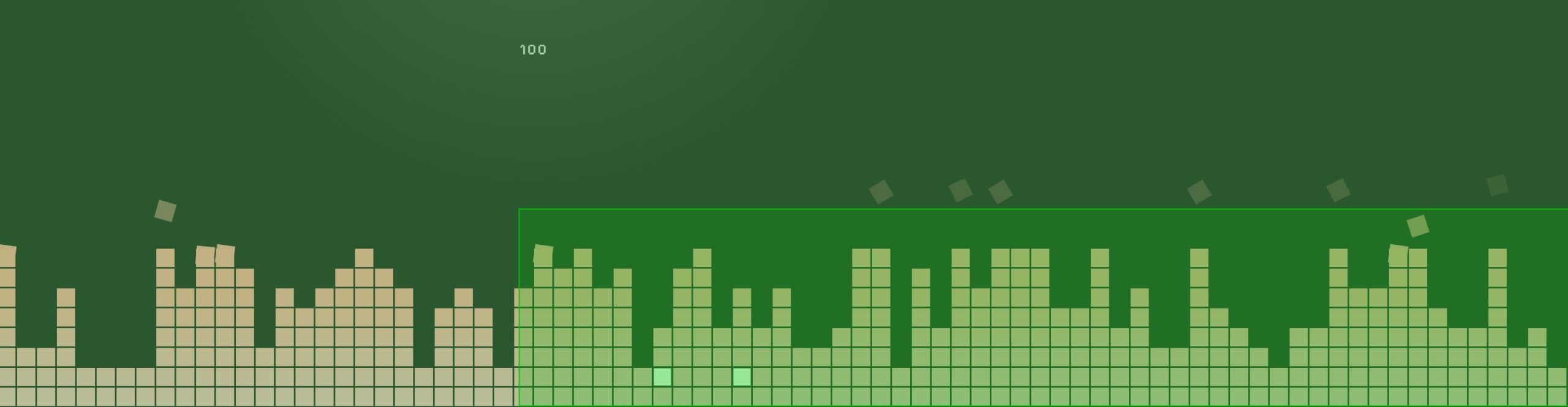
It began with doing a few Google image searches to gather inspiration. I started with the idea of “pixel” and after getting a few reference images I decided on creating these pixel bars that have a very close resemblance to audio visualizers. I’ve enjoyed working with gradients on other projects in some unexpected ways so that’s what I wanted to add here as well.
After toying around with a few ideas I arrived at masking a simple rectangular gradient with the pixel bars. I could then make it a bit more interesting by animating the gradient on the Y axis so that different parts of the gradient can be exposed.
With this in mind I created a static representation of this idea that can be viewed here on CodePen.
Version 1.0
Having this static concept come to life was great, but there was a lot of room for improvement. For instance these are the questions I began asking myself:
- How can the amount of columns become dynamic based on the width of the container? How can the squares within be randomized?
- How can this become interactive? (I wanted to add a bit of gamification fun to it)
- How else could this be used as a focal point for the rest of the website?
With those questions in mind I broke the project down piece by piece to realize the full extent of what needed to be created:
How can the amount of columns become dynamic based on the width of the container? How can the squares within be randomized?
- Use JavaScript to create and apply the main SVG and its containing elements (groups, rects, etc.).
- Determine how many columns are needed based on the width of the container.
- Randomly generate a number of boxes (pixels) for each column to keep it different and interesting on page load.
How can this become interactive?
- Allowing the individual squares to be clickable in some way was something I determined could be interesting.
- This resulted in adding a point system to clicking the squares to encourage users to click more and see the numbers go up!
How else could this be used as a focal point for the rest of the website?
- Another component was being worked on for changing the theme of the website. I decided it’d be more interesting to merge it with this component to allow the user to alter the color scheme.
- This opened up the path for using a variety of different schemes in a more fun way. It would be determined by an interval of points gained from clicking on the boxes.
Bumps in the road
With all the planning, and my static concept, in place I was ready to really bring this idea to life. Everything progressed smoothly with dynamically creating the SVG itself and adjusting its output on each page load.
However, the first issue came up with the clickable interactive element I wanted to add to each interior <rect> element.
Adding a clickable layer
When you use an an element as a mask inside a <mask> element or as an image, the element and its children don’t retain normal interactivity regarding event listeners in the DOM.
I was adding click events to the <rect> elements within the SVG, but the click wasn’t “punching through” the mask to the individual elements in order for the events to fire…. To solve this I decided to duplicate the SVG, render it transparent, and overlay it over the original element. I’m still mostly happy with this solution, but the main drawback here is the amount of elements now being added to the DOM.
A fully clickable layer was created with this duplicated SVG since it wasn’t acting as a mask. It was mapped up to and positioned exactly the same as the original mask so everything lined up as if there was only one element.

Point system
Now that the elements could be clicked on I proceeded to add the gamification layer to the component. In and of itself it’s pretty simple, but allowed me to experiment with animating CSS custom properties using @property – this let’s something that usually can’t be animated (such as numbers changing) to be animated as the value is adjusted.
Another thing that was surprisingly fun to experiment with was transitioning between gradients. This is also something that can be achieved using the same technique.
Animation and Cross Browser Compatibility
The next issue came up as I was attempting to now add CSS animation to the <rect> elements. Whenever you’re using the transform property to animate SVG’s you can run into issues with the transform origin. Basically child elements of an SVG apply transforms from the origin of the <svg> viewport, at coordinates (0, 0), parent element rather than from itself. This is different from what you may expect as regular HTML elements apply transforms based on their own position.
To get around this you can use the really handy CSS property and value transform-box: fill-box on the SVG elements you’d like to apply a transform to and then use the origin property such as transform-origin: center. This allows it to behave like how you’d expect a normal HTML element to act and has great browser support too!
With this in place I could now apply transform based animations on my interior SVG elements which resulted in the move and rotate effect for columns that had a max number of <rect> elements.

<rect> elementsAt this point I felt as though I had everything in place to wrap up except I started running into big issues with the transform based animation on browsers that weren’t Chromium based. See the videos below to get an idea of what the issue was:
<svg> viewport origin (0, 0)Ultimately I determined the cause of this was due to how I was applying the mask. Apparently other browsers make different calculations for the <mask> SVG element and its contents – which is what I was using. This made applying CSS to the <rect> elements in the SVG, being used inside the <mask>, unpredictable across browsers. For instance, in Chromium you can inspect and see the dimensions of the elements within the <mask> directly using the browser tools. Others, such as Firefox, would have 0 width and height and the aforementioned transform-box: fill-box would not work as expected.
I was unable to come up with a great solution with the current markup, but I didn’t want to cut corners or sacrifice the effect because of browser compatibility. To make matters worse I was running into a bit hit to performance on non Chromium browsers based on the amount of infinite animations that were taking place and how the animation was being defined.
Because of the issues that were piling up I started looking into other solutions for a unified and performant experience.
Version 2.0
Since I knew that the animation issue was due to the <mask> element itself I started brainstorming how else masking could be applied. From previous experience I’ve used the CSS mask-image property to great effect with supplied SVG assets.
Going this route I knew how much flexibility using an image could allow me since you can embed styling directly into the SVG* that will be used when it is rendered. The only issue is I didn’t want to use a static SVG! I had already done all the work to make the columns and squares dynamic.
* This is a really great way to embed animation or other effects into background images as well!
Before committing to this solution I quickly put together an SVG file with the markup of the dynamic SVG being generated on page load and applied it using CSS instead. Additionally I added all the animation currently being applied to the elements, within the <mask>, to the SVG file directly to get a proof of concept together since I could no longer directly target the elements externally.
As luck would have it this worked! I not only had masking, but also consistent animation for the elements within the mask across browsers. Another bonus of going this route is that the SVG wasn’t being rendered directly in the DOM anymore so we had less elements increasing our DOM size. Nice! 👍
If I could somehow take the dynamic SVG I was creating in JavaScript and apply it as an image using the mask-image CSS property then everything could be completely recreated using this new masking technique…
At this point I didn’t even know if this was possible or not so I started doing some research. I found a few Stack Overflow questions that had partial solutions to what I was trying to do. I eventually understood that you could take SVG markup and encode it to create a data URI using the btoa() function in JavaScript. This would take all the code and allow it to be applied as an image, using the CSS url() function, like what I was aiming for.
After a bit of tinkering I eventually was able to get it to work using these methods and applied the data URI of the SVG as value for the mask-image CSS property.
This added flexibility also allowed me to create the mirrored effect underneath the original mask as well to add a bit more depth to the component. I used another mask, this time a gradient, for a faded look that I think turned out pretty well.
Resolving Performance Issues
Now that everything was working as intended I could focus on the other issue at hand which were the pretty drastic performance hits on any browser that wasn’t Chromium based.
As I was looking into solutions I came across a great guide on high-performance CSS animations and upon investigating my animations I came across many flaws!

transform: translate3d()
transform: translateY()The animation referenced above is what is applied to the blocks that float and rotate up. Although using transform: translate3d() isn’t specifically motioned in the article I noticed that could be something quick to swap out and see if it helped make an impact.
I ended up applying this change across the entire component which affected the moving gradients, the points ui, and the blocks. It turned out that this small edit was enough to make a very noticeable visual impact on performance with other browsers.
I additionally experimented with the will-change property and added that to the elements that I thought could be pushed to a new layer as another way to help optimize the moving parts. I observed noticed some improvements using the property so I ended up keeping it in place.
Future Considerations
Overall I’m really happy with how this component turned out! I feel like it accomplished everything I was going for with the goal I had in mind for the website. That said there are some things that could likely be improved upon for a future iteration.
In fact, a few ideas I have to change aspects of the component are:
- Rendering in a
<canvas>element- Pros:
- I think this could have a huge positive impact on performance and further eliminate excess DOM elements.
- It would clean up the code drastically with the only item appearing on the front end being the canvas itself.
- Cons:
- Most existing code would have to be completely rewritten.
- Pros:
- Tidy up the gamification
- I like the idea I went with for the points and how the site theme changes with the interactivity, but currently I’m not confident many users will engage with it. It needs a bit more visual clarity that’s it can be interacted with.
- I added a block that twitches in order to give a visual feedback indication that “something happens here” to help with this, but more could be done.
- A bigger impact could be added with the first click too in order to make it more exciting to inspire more reaction.
- Further performance tweaks
- Since nearly a full rewrite would be needed for using canvas I think a half step forward could be looking deeper into potential gains with the developer tools.
- For example this screenshot shows areas that are repainted. The inner rectangle appears when hovering over elements in the click layer, so that could be investigated since it’s way larger than expected.
I’m sure I’ll think of more things to tweak and change as time goes on!